In this lab we were given census tract data and high school boundary data and told to determine the approximate number of students who fall in each school zone. The issue is that the census tract polygons and the school boundaries do not align in any useful way. By splitting census tracts that fell within different high school boundaries, then weighting the population estimate based on the area that fell in each boundary (i.e. aerial weighting), a relatively accurate and easy-to-produce estimate was determined; error was at 10.95%. Then, by incorporating land cover data, specifically imperviousness, the error decreased to 10.19%. The imperviousness of each split census tract was used to weight the proportion of the entire census tract that would be assigned to it. Using the dasymtric mapping method was useful for projects like this, because surveying a community individually would require large amounts of time and resources, though accuracy would be higher.
Tuesday, December 9, 2014
Lab 15 – Dasymetric Mapping
Dasymetric mapping is a mapping technique that involves using ancillary spatial data to improve the visualization and accuracy of spatial phenomenon that is known to not be uniformly distributed throughout the landscape. An example of this is population density, which is presumed to vary greatly spatially within the census tracts which are used to estimate density. By using smaller aerial units, say census blocks, we know that the population density is not uniform within the census tract. By using land cover data, the accuracy can be improved further, as we presume that population density is zero in forest areas and water bodies otherwise not accounted for.
Thursday, December 4, 2014
Lab 14 – Spatial Data Aggregation

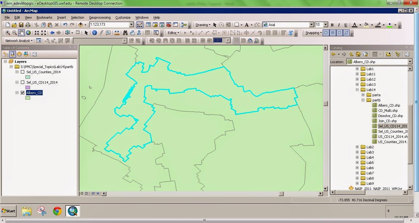
Gerrymandering is the manipulation of political boundaries so as to favor one party or class. The favorable outcome is a result of the statistical influence of scale and zonation of areal units. This manipulation of boundaries often produces odd shaped districts. The two images to the right show two outcomes of gerrymandering. The top image depicts a district boundary that chops up a county. The bottom image depicts a very elongated, irregular district.
Wednesday, November 26, 2014
Lab 13 – Effects of Scale

The
elevation data comparison shows that the LiDAR DEM had a greater range of values
compared to the SRTM DEM; the minimum value was smaller and maximum value was
larger for the LiDAR DEM. This may be an
indication of greater elevation resolution.
The mean elevation value was lower for the LiDAR DEM. Though these differences are apparent here, the
magnitude of the difference is small and not likely significant.
The
slope and aspect summary statistics are highly similar between the two datasets
as well. The mean slope of the SRTM DEM is
smaller, though this can be inferred based on the smaller range in elevations
of this DEM. It may be assumed that the
LiDAR data is more accurate; however, the overall difference between the two
datasets is very minimal. I suspect the
LiDAR dataset is more accurate for two reasons: First, it is the product of a resampling
technique whereby the underlying accuracy of the high resolution 1-m DEM is
certainly higher than the derive 90-m DEM.
Second, the SRTM DEM was created via orbital spacecraft, which, inherently
introduces a higher degree of vertical measurement error.
Friday, November 21, 2014
Lab 12 – Geographically Weighted Regression
Spatial regression can be used in GIS to model a phenomenon of interest. In non-spatial regression analysis, spatial auto-correlation is generally undesirable. Spatial regression attempts to quantify auto-correlation and use it as an explanatory variable. Geographic Weighted Regression (GWR) is a specific spatial regression used to account for multicolinearity. In the lab this week we compared GWR to OLS regression. The model output from GWR regression was better (i.e. had a lower AICc) than the OLS model. Further the z-score was lower, indicating that there was spatial dependence in the phenomenon of interest.
Wednesday, November 12, 2014
Lab 11 – Multivariate Regression, Diagnostics and Regression in ArcGIS
Regression analysis can be used in ArcGIS to model a phenomenon which may vary spatially. There are three main reasons for regression analysis: 1) to predict values in unknown or un-sampled areas, 2) to measure the influence of variables to a particular phenomenon, or 3) to test hypotheses about the influence of variables on a phenomenon. It is very important to test the usability, performance, or predictive power of a model due to its potential in policy decisions. There are several diagnostics to test the performance of a regression model that go past simply determining the R-squared value (which may be very misleading). ArcMap contains an Ordinary Least Square regression tool, among others, which produces some of these diagnostics, however it is up to the user to evaluate these statistics in the context of the model. The six step process outlined by ESRI to interpret these statistics provides a foundation for determining the "best" model. One important thing to note is the frequency distribution of residuals in a histogram. The residuals should be distributed standard normal. A positive or negative skew may be the result of spatial auto-correlation. This is perhaps the biggest use of regression analysis is GIS, as spatial analysis is central in ArcMap processing.
Tuesday, November 11, 2014
Module 10 Lab: Supervised Classification
 |
| Above is a supervised classification of Germantown, Maryland generated using ERDAS Imagine supervised classification. The map was ultimate composed in ArcMap. |
1.
I
used the seed polygon method to generate the signature polygons. A distance threshold value of approximately 25-50 was generally used. In cases when only one class was
created and the class was relatively obvious, for example water, then I used a
higher distance threshold value. In cases when there were
many classes for the same classification, for example Agriculture 1-4, I used a
lower threshold values. The lower values and many
classes allowed for high coverage with minimal (or none) mis-classification.
Tuesday, November 4, 2014
Module 9 Lab: Unsupervised Classification
 |
| A map depicting the unsupervised classification of University of West Florida campus. There are four different Information Classes. |
Friday, October 31, 2014
Lab 9 – Accuracy of DEMs
Like any interpolated raster surface, a DEM is derived from an array of measured points, specifically elevations. What is important for interpolated surfaces is the error introduced during the interpolation process, thus the accuracy and predictive power of the DEM. The accuracy of a DEM can be determined by comparing interpolated values to known/measured co-located values. These points can be surveyed after the DEM is created or can be withheld from the interpolation process and used to validate the model. One method of collected data for DEM generation is via LiDAR. To check the accuracy of LiDAR-generated DEMs it is important to test several land cover types individually, as they may have different relative inaccuracies.
Tuesday, October 28, 2014
Module 8 Lab: Thermal & Multispectral Analysis
 |
| Multispectral image of Coastal Ecuador highlighting the color contrast of several distinct features. |
The portion of the map that I selected is an
agricultural area of the river bank. I
chose this entire area because it was a diverse area, thus providing a good
contrast of land features. There is a
freshwater river with a forested island, and on the main land is an
agricultural area surrounded by an urban area.
The band combination that was selected appropriately highlights these
different features. Red was linked to
Layer 4, Green was linked to Layer 2, and Blue was linked to layer 6 (Thermal
IR). Accordingly, the vegetated island
(high NIR, low temp) appear bright red, the urban areas to the east (low NIR,
high temp) appear bright blue, and the main river (low NIR, low temp) appears
green.
Further, shape and pattern are useful in
identifying these features. Agricultural
lands are often regular polygons (rectangles, or otherwise straight-edged) and
would be expected to appear more blue than red in my image, which is the case. The river and forested island are obvious
based on association.
Wednesday, October 22, 2014
Lab 8 – Surface Interpolation
 |
| An output from raster calculator determining the difference between two output interpolation rasters using the same input points values |
Tuesday, October 21, 2014
Module 7 Lab: Multispectral Analysis
 This weeks lab involved using multispectral analyses processes to locate specific features within aerial imagery. Generally four steps are followed: 1) examine histograms of the imagery pixel data; 2) visually examine grey scale image; 3) visually examine multispectral image; 4) use inquire cursor tool to isolate specific cell values. The following are three such examples of this process. Features are highlighted by their contrast to background features.

Wednesday, October 15, 2014
Lab 7 – TINs and DEMs
 |
| Unmodified TIN |
 |
| Modified TIN with lake feature burned in |
Tuesday, October 14, 2014
Module 6 Lab: Spatial Enhancement
 |
| Image Enhancement output from ERDAS Imagine and ArcMap Processing. |
Thursday, October 9, 2014
Lab 6 – Location-Allocation Modeling
 |
| Output of new Market area coverage by distribution facilities |
Wednesday, October 1, 2014
Lab 5 – Vehicle Routing Problem

Tuesday, September 30, 2014
Module 5a Lab: Intro to ERDAS Imagine and Digital Data 1
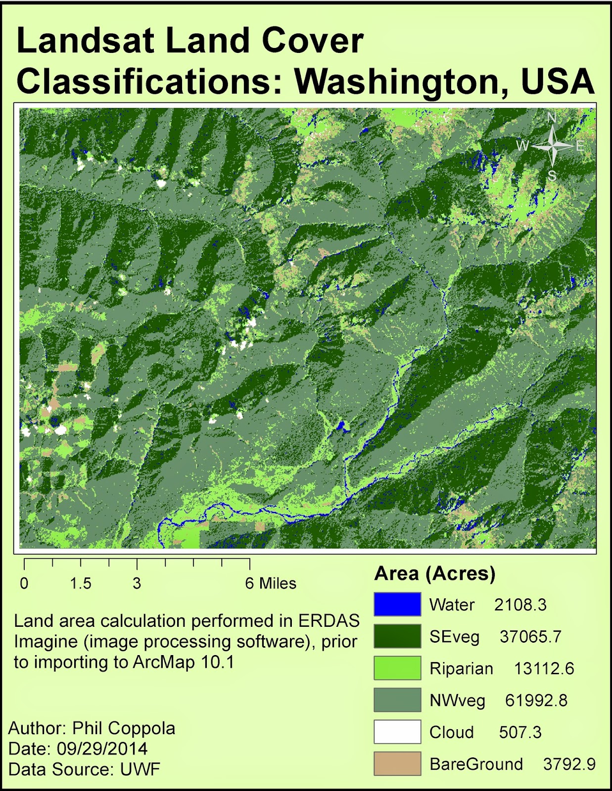 |
| Final map output of landcover generated from Landsat data first processed in ERDAS Imagine and ultimately in ArcMap. |
Wednesday, September 24, 2014
Lab 4 – Building Networks
This weeks lab involved network analysis. Routes were determined under a few different conditions including turn restrictions and predicted traffic. Turn restrictions are relevant when dealing with one-way streets and large road medians. Predicted traffic influences the time cost of traversing certain roads. Ultimately, adding model inputs changes the optimal route; however, the significance of the change may be minimal.
Tuesday, September 23, 2014
Module 4: Ground Truthing and Accuracy Assessment
 |
| A map depicting accuracy proofing of LULC data of Pascagoula, MS. |
The overall accuracy is determined by comparing random points placed on the original LULC map to those same points found in Google StreetView or aerial imagery. The overall accuracy of the LULC is determined by the number of "true" points divided by the total points. The accuracy of my LULC map was 77%.
Wednesday, September 17, 2014
Lab 3 – Determining Quality of Road Networks
 |
| A comparison of "completeness" between the national TIGER data set and a local, county-level, data set. |
This was applied in lab by assessing the completeness, defined as road length, between a local and national road data set. The map product at the right shows the comparison.
Tuesday, September 16, 2014
Lab 3: Land Use / Land Cover Classification Mapping
 |
| Above: Map of land cover land use classification of Pascagoula, Mississippi using USGS LCLU Level II classification scheme. |
Wednesday, September 10, 2014
Lab 2: Determining Quality of Road Networks

Digitized
features of the road network database from the city of Albuquerque tested 13.09
feet horizontal accuracy at the 95% confidence level using NSSDA testing
procedures.
Digitized
features of the road network database from StreetMaps USA tested 688.94 feet horizontal
accuracy at the 95% confidence level using NSSDA testing procedures.
Tuesday, September 9, 2014
Module 2 Lab: Visual Interpretation of Aerial Images


In the second exercise, specific features were identified using size and shape, patterns, associations, and shadows. Once a single object is positively identified (with a high degree of certainty) than it can be used as a reference in identifying other features. For example, once you locate and identify a road, you can confirm the identity of a vehicle. Then a building can be identied. Because these aerial images have no scale to reference, within-image references are very useful. A knowledge of the area (Pensacola BEach in map 2 at right) allows the user to determine water and pier features.
Wednesday, September 3, 2014
Lab 1: Calculating Metrics for Spatial Data Quality

As part of the lab, we were provided an array of waypoints that were collected from a single geographic point using a Garmin GPS device. We then had to calculate estimates of precision and accuracy after we were then given the "true" reference location. Below are two outputs of these calculations:
Horizontal Precision (68%): 4.45 meters
Horizontal Accuracy = 3.23 meters
Horizontal precision, which is a metric of the clustering of repeated measurements of a data point, was calculated by determining the average distance of all the repeated measurements to the average of these measurements. The accuracy was calculated as the difference between the average point from the repeated measurements and a given "true" reference point.
Tuesday, August 5, 2014
Module 11: Sharing Tools

This week's assignment involved properly packaging and sharing a tool. This required setting correct parameters, relative file extensions, and providing metadata. The tool generated an array of random points placed within a specified area, then created a buffer around each point (screenshot at right). The Description for the tool was edited in ArcCatalog so that it was more user friendly, providing easy-to-follow parameter requirements. The script from which the tool was based was then directly embedded into the tool and password protected. Embedding the script in this way reduces the number of individual files that must be sent to another user for the tool to run properly, and it provides security (using password protection) against unwanted interceptors of the tool's script.
As this is our last module, below is a recap of the GIS Programming Course...
Employing the existing
capabilities of a GIS, Python scripting can be used to complete otherwise
time-intensive geoprocessing tasks. This
GIS Programming course provided a solid foundation for future work within the
field. We started with an introduction
to pseudocode, a near-English version of a script that provides a workable
rough draft for the author and a potential reference to another user. We then explored similarities and differences
between Python scripting and ModelBuilder in ArcMap. Next, were several modules that involved writing
and editing Python scripts to perform various tasks and produce desired
outputs. During these weeks, a level of comfort in
working with Python was achieved. Both raster
and vector datasets were manipulated and scripting proficiency was quickly
increasing. Debugging and error checking
procedures were followed in PythonWin so that script issues could be quickly
discovered and fixed. Finally, custom
tools were created and shared. Python is
a fundamental tool in the GIS professional’s tool belt as it allows for complex
analysis and timely output production.
This course was broad and deep in content and thorough in delivery – a great
experience overall.
Friday, August 1, 2014
Module 10: Creating Custom Tools
 |
| Custom Tool window |
 |
| Script Message output |
1.
Generate a script that contains unspecified input
and output variables and will complete a process of interest
2.
Create a new toolbox in ArcMap using the Add
> Toolbox dropdown in ArcCatalog
3.
Add the script (the script generated in step 1)
to the toolbox
4.
Set the parameter options for the script/tool
5.
Connect the input parameters of the tool to the input
and output variables in the script
6.
Add messages to check for progress of the tool
and for debugging issues.
7.
Check to see if output is as desired, if not
then debug script
Friday, July 25, 2014
Participation Assignment #2: Migration Patterns of Northern Saw-Whet Owls

In this paper, researchers mine a
bird banding database to tease apart patterns of migration and large scale
movement for the Northern Saw-whet Owl (NSWO) in eastern North America. The United States Geological Survey (USGS)
oversees several bird banding stations in the United States and manages the large database produced from them. Bird banding stations are permanent, semi-permanent,
or temporary field locations where ornithologists capture target bird species
and place on them leg bands engraved with unique serial numbers. The overall number of birds caught at
specific banding stations may fluctuate seasonally or annually; thus,
population trends or mass movement patterns may be detected using relevant spatiotemporal
analyses. Further, birds with bands can
be recaptured within or between years so that individual movement and migration
routes can be analyzed.
The Northern Saw-Whet Owl is a
small owl that resides in the United States.
This study attempts to use banding records of this bird to determine if
it migrates southward during the fall season, if individuals follow similar
migration routes between years, and whether there is any age-related
differences in movement. They use a GIS
(ArcView 9.3; ESRI 2008) to complete these analyses.
 They examine the number of banded NSWOs
using of 01° latitudinal lines as groups.
They find that the peak banding day – i.e. the mean Julian day – occurs
later in the year as your move further south.
Thus they determined that NSWOs have a mass migration south during the
fall months (fig. 3, Beckett & Proudfoot 2011). Then, by creating vectors from original owl
capture to recapture locations, they generated a rose diagram depicting the southerly
movement for the birds during fall (fig. 5, Beckett & Proudfoot 2011).
They examine the number of banded NSWOs
using of 01° latitudinal lines as groups.
They find that the peak banding day – i.e. the mean Julian day – occurs
later in the year as your move further south.
Thus they determined that NSWOs have a mass migration south during the
fall months (fig. 3, Beckett & Proudfoot 2011). Then, by creating vectors from original owl
capture to recapture locations, they generated a rose diagram depicting the southerly
movement for the birds during fall (fig. 5, Beckett & Proudfoot 2011).
This paper is significant in that
it answers a large-scale question utilizing a public-access database – in other
words the data was gathered, not collect, by the researchers. They illustrate the use of databases and GISs
as a foundational tool for understanding ecology of animal populations. With increasing technological advances and
utilization, similar research will continue to be produced.
link to paper: http://www.projectowlnet.org/wp-content/uploads/2011/09/Beckett-and-Proudfoot-2011-Wilson.pdf
Thursday, July 24, 2014
Module 9: Debugging & Error Handling
 |
| Output for Script 1 |
 |
| Output for Script 2 |
 |
| Output for Script 3 |
The assignment involved debugging three scripts in various ways, creating the outputs seen at right. PythonWin contains its own debugging interface, which was used to help the user locate or trap exceptions. In the Output for Script 3 (below), an error message is presented, but the script was allowed to continue. Essentially, that portion/block of script was passed over.
Friday, July 18, 2014
Module 8: Working with Rasters
 |
| Final raster output that meets all criteria. |
This week's lab involved working with rasters using the spatial analyst module in arcpy package. Rasters allow for the display of continuous spatial phenomena and analysis using a GIS has made complex processes relatively simple. The final lab output was a raster meeting three specific criteria. These were: a specific landcover type, a slope between 5 - 20 degrees, and an aspect between 150 - 270 degrees. The script written uses only DEM and landcover inputs. At rights is a final raster output, below is a discussion of an issue that I encountered during the lab and how it was resolved.
1. The only issue I had was that my final map
displayed a raster with values of 1, 0, and NoData and thus looked different
than the example shown on the assignment PDF.
Immediately I recognized that this was likely due to the landcover reclassification step. The original
script was as follows:
>>> outreclass = Reclassify("landcover",
"VALUE", myremap, “NoData”)
2.
I investigated the Reclassify tool’s syntax
through ArcMap help > Reclassify tool.
3.
“NoData” was displaying differently because I
had specified it to do so in the script.
The final argument of how to represent NoData was optional, but I had
entered it in. The original script was
copied from the Mod8 Exercise, this was the root of the problem. In the Mod8 Exercise we purposely wanted to
specify cells with NoData; however, in the Mod8 Assignment, we want to specify
all cells that do not meet the criteria with a value of 0.
4.
Therefore, I removed the last, optional argument
in the original script, creating the following final script, which ultimately
produced the correct final raster:
>>> outreclass = Reclassify("landcover",
"VALUE", myremap)
Monday, July 14, 2014
Week 9: Corridor Analysis
 |
| Corridor model |
The corridor output at right shows a predicted black bear corridor. The parameters used to create this corridor were elevation, land use (not shown), and roads (not shown). Bears prefer certain elevations, certain habitats, and avoid roads. So a suitability analysis was performed to find the most bear-friendly areas. Then the corridor analysis was use to create the best path between the two units.
Friday, July 11, 2014
Module 7: Working with Geometries
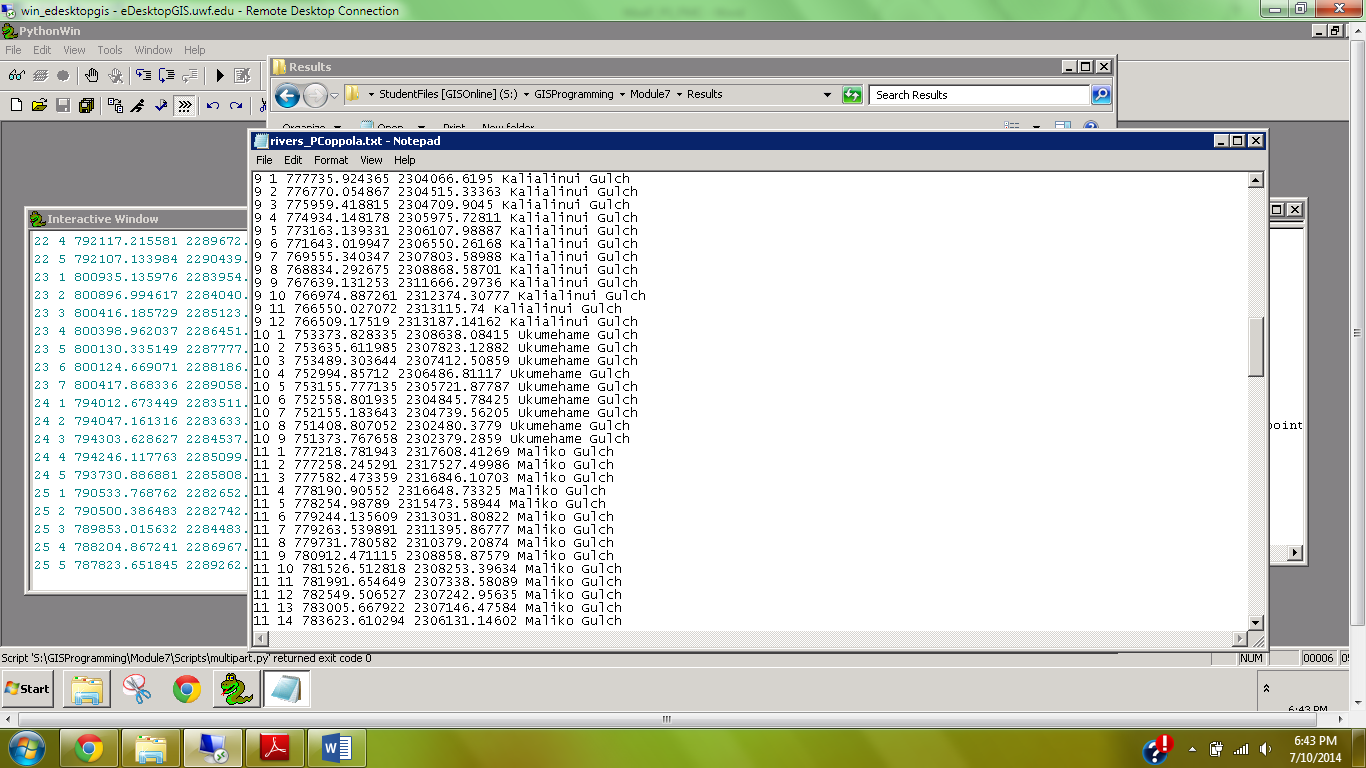 |
| Screenshot of rivers_PCoppola.txt file |
Monday, July 7, 2014
Week 8: Network Analysis

Sunday, June 29, 2014
Week 7: Suitability Analysis
 |
| Final map product outputs |
First, a raster grid displaying a landscape of suitability for each criterion was made. Generally, places on low slopes, far from rivers, close to roads, on particular soils, and on particular land cover types were considered more suitable. Then, the five criterion themselves were weighted. The map compares the equally weighted criteria output, and the unequally weighted criteria output. In real applications, weight assignment is determined by accepted research, personal observation, or popular opinion within the decision-making community. Clearly in the map above, slope has a large influence on the suitability of particular areas.
Friday, June 27, 2014
Module 6: Exploring & Manipulating Spatial Data
 |
| Python Script Output |
This weeks assignment was to dive deeper into Python scripting by manipulating lists, dictionaries, tuples, and using cursors. List, dictionaries, and tuples are similar in that they store indexed data, however there are nuances to each that allow for diverse usage. Spatial data is often stored in some sort of indexed format (tables) which must be easy to reference and manipulate. The assignment here involved generating a geodatabase and editing some fields of a feature class within.
At right is a screenshot of my script output, which was used to select only county seats from a list of cities and then match each county seat with its population using a dictionary. Below is a discussion of some issues I had during write-up and how they were overcome.
I had the most trouble with Step 5, which involved setting
the search cursor to retrieve three fields while using an SQL query to only
select County Seat features. The issues occurred
in three places of this step: 1) Setting
the workspace; 2) calling the correct feature class; and 3) determining the
syntax of the Search Cursor.
The first issue was merely an unnoticed typo, but it cause a
lot of troubleshooting because I thought other parts of this step were causing
the error message. Typos are small
errors that can cause big headaches.
Once realized this, it was quickly fixed and I moved on.
The second issue was a result of not knowing what file
extension to use for the feature class cities
in the new geodatabase. I first used
.shp, but this gave me an error saying that the file could not be located. I then used windows explorer to determine if
the extension had changed, and I found that it had changed to .spx. Therefore I tried calling the feature class
using this extension. This again gave
me the same error message. I then
thought that perhaps the basename extraction step (i.e. removal of .shp during
copying step), produced a file with no extension, therefore I tried simply
using ‘cities’, and this worked. I then
moved on to issue three.
Issue three was the toughest because I wasn't sure whether
to use brackets, parentheses, quotation marks, commas, semicolons, etc. when
using the Search Cursor. Essentially the
amount of info that was covered this week left me a little confused. I realized, however, that I was over-thinking
the problem. I knew that the three
fields needed to be within brackets, separated by commas, and within quotes. Then I referred back to the exercise to
determine how to use the SQL query, which was straightforward.
Monday, June 23, 2014
Week 6: Visibility Analysis
 |
| Finish Line Camera Coverage Map (symbology described in text) |
We also used veiwshed analysis to make an informed decisions about surveillance camera placement around the finish line of the Boston Marathon. We were restricted to a 90 degree field of view for our cameras, and there were several buildings which obstructed possible placement. I first analyzed aerial imagery to determine building locations, as I wanted to place the cameras on top of a tall structure. I then used a DEM which included building height to determine how high these cameras would be placed. The viewshed tool produced a raster with cell values from 0 - 3, where the value represented the number of cameras that captured that particular cell. Cells with a value of 3 were colored red, 2 were yellow, and 1 were green (zeros were omitted). Above is my output using this symbology. [The cameras are magenta triangles and the finish line a blue dot]. All three of the cameras had an unobstructed view of the finish line as well as much of the surrounding area.
Friday, June 20, 2014
Module 5: Geoprocessing Using Python

1. First, I looked in the help window for a description on the Add XY tool as well as the Dissolve tool, just to get an idea of how they worked and what they did.
2. Next, I opened the ArcMap Interactive Python window as well as the PythonWin program. I first used the scripts in ArcMap so that I could visually see what was happening to the data, then copied the text to a new script file in PythonWin.
3. Because the script should be standalone (outside of Arcmap), it first required to import the arcpy site package. Then, I imported environment class and set the overwrite option to ‘true’.
4. Then I used the three tools in sequence: Add XY, buffer, and dissolve. I followed the syntax described in the help folder as well as the easy to follow interactive python help window in ArcMap.
5. After each tool I added the GetMessage function. Further I used the ‘+ “\n”’ after the first two tools so that the message was easier to read.
6. I tested the tool in PythonWin and ArcMap to see if the desired result occurred; it did.
Monday, June 16, 2014
Week 5: Crime Hotspot Analysis

This week's lab involved creating several different Crime Hotspot Maps and comparing them in their predictive power. We created hotspots using Local Moran's I, Kernel Density, and Grid Overlay from 2007 burglary data. Then we compared the number of 2008 burglaries within these 2007 hotspots.
I
argue that the best crime hotspot predictive method in this scenario is using
Kernel Density. I base this on the
observed highest crime density of 2008 burglaries within the 2007 hotspots. This
is category (above) that I view as the best metric of predictive power because
it takes into account hotspot total area, and thus would provide efficient
preventative resource allocation.
It
is clear that the Grid Overlay hotspot contains the most 2008 burglaries,
therefore it is certainly a suitable predictive tool. However, the total area is >65km2 and
may be too large to effectively patrol by police. With unlimited resources (i.e. police
officers/vehicles), it would be feasible to use this model as area to patrol. In
a limited resource situation – which is what is most often the case – higher
priority areas must receive preferential resource allocation. Thus, the Kernel hotspots.
The
Local Moran’s I hotspots are large, but contain the fewest amount of 2008
burglaries. The large area appears to be
a result of extreme density regions. By
visual assessment, it appears that areas between several clusters, which don’t
look particularly dense themselves, are influenced by adjacency (see screenshot
below). It appears that the red area
toward the top is in between two hotspots.
Friday, June 13, 2014
Module 4: Python Fundamentals - Part 2

This weeks assignment involved debugging an existing script as well as writing our own to produce a desired outcome. A script that was given to us was supposed to produce a simple dice rolling game between several participants, but it had several errors in need of correction. To fix these errors, the debugging toolbar was used and error messages were interpreted. Eventually the output was produces as seen above.
We were then required to randomly generate a list of 20 integers between 0-10 and remove a specific 'unlucky' number. I chose the number 6 as my “unlucky” number,
which was removed. To print the number of times that 6 appeared in
my original list, I used the if-elif-else structure. Using the count method to determine the number of 6’s in the list, I chose
the following three conditional outputs:
If there were no sixes, then it would print “This list contains no sixes.”
If there was one six, then it would
print “This list contains 1 six, which was removed.” If there were multiple sixes, then it would
print “This list contains (the number of sixes), which were removed.
I used the while loop and the remove method to
remove each six sequentially from the list until the list contained no
sixes. Then the new list with all sixes
removed would be printed.
Monday, June 9, 2014
Week 4: Damage Assessment
 |
| Damage Assessment of structure on East New Jersey coast after Hurricane Sandy |
This weeks lab involved damage assessment of structures near the New Jersey Coast after Hurricane (super storm) Sandy in Fall 2012. Damaged structures in this case were homes and businesses that were inundated or wind-ravaged. We compared pre- and post-Sandy aerial imagery of our study area and visually determined the severity of damage (see image top-right; description below). Then, we regressed the severity of structure damage on the distance from the coastline in intervals of 100 meters (e.g., 0-100m from coastline, 100-200m, etc.; see table below).
I first coarsely assessed the entire affected area using pre- an post-Sandy aerial imagery. This visual assessment included areas outside
the delineated study area that were highly affected, as well as areas that appeared almost
entirely unaffected. This was done to make my damage assessment more objective. Based on this
broad-scale approach, I determined that the study area was one in which structure
damage was highly variable – some properties were destroyed completely, while
some looked unharmed. Further a majority
of destroyed structures were located in the easternmost region of the study area.
The
general process of identifying the structural damage for each parcel was a left to right sweep of each block. This allowed sufficient detail without taking
hours to process a small area. I primarily used the
‘slide’ effect tool to compare the two aerial images of the pre- and post-Sandy study site. If
a structure was clearly moved from its original foundation or was leveled, then
I chose to label it as destroyed. Some
structures were absent all together, those were labeled as ‘destroyed’ as well. If a structure had major collapse, which was
noticeable from aerial imagery by debris or a change in shape, then it was
labeled ‘major damage’. 'Minor damage' was
subjectively decided to describe a home that was generally surrounded by other severely affected homes, but was not obviously damaged from imagery. ‘Affected’ was given to any home that
appeared to have debris in the yard, which I presumed to be material from the
structure. A structure was labeled ‘no
damage’ if it appeared generally identical in shape to the pre-Sandy imagery,
and was surrounded by other homes which appeared unharmed. This was based on the assumption that
adjacent homes protected those upwind and uphill of the storm.
|
Structural Damage Category
|
Count
of structures within distance category
|
||
|
|
0 – 100 m
|
101 – 200 m
|
201 – 300 m
|
|
No Damage
|
0
|
1
|
7
|
|
Affected
|
0
|
9
|
24
|
|
Minor Damage
|
0
|
16
|
6
|
|
Major Damage
|
0
|
8
|
4
|
|
Destroyed
|
12
|
6
|
4
|
|
Total
|
12
|
40
|
45
|
Subscribe to:
Comments (Atom)