Friday, January 31, 2014
Module Three: Cartography in GIS
Above are three maps of Mexico, each highlighting a different feature: the first (top of post) is a chlorpleth population map of Mexican states; the second (middle of post) is a map of major cities and transportation routes in central Mexico; the third (bottom of post) is an elevation map of mexico. They were all generated in ArcMap 10.2. This lab assignment allowed for some freedom of creativity in the topography map, therefore, I chose to orient that map in a portrait because I could more easily fit the map elements (legend, scale) and inset map.
Thursday, January 23, 2014
Module Two: Own Your Map
Above is a map showing the location of University of West Florida in Escambia County with an inset of the state of Florida. I chose to use the same green (lotus pond green) to fill the county as I did to border the state and counties in the inset. This map introduced several new concepts in ArcMap like clipping features and formatting the legend. Overall, this has been the most informative assignment.
Tuesday, January 21, 2014
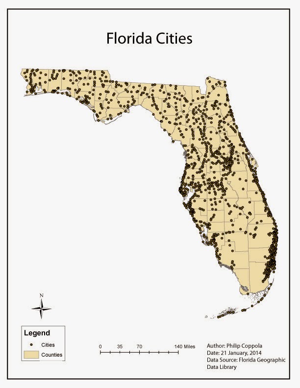
Module Two: Introduction to Adobe Illustrator
This is a map of Florida counties and cities. It was originally created in ArcMap 10.2, then modified in Adobe Illustrator to produce this final product. This was my first experience using AI, and it was a success. The tools and gadgets are relatively intuitive for quick use or detailed manipulation. However, I did have an issue with the layer palette. When the map was exported from ArcMap's .mdx to AI's .ai, the groups were not lumped appropriately, resulting in more work than was required to achieve the look I wanted. I am still in the process of figuring out what went wrong and how to fix the problem. Good luck all!
Friday, January 17, 2014
Module One: Map Critique
This South Carolina Wildlife Management Area Game Zones
map is an example of a well-designed map.
The map is effectively labeled (commandment 3) with county boundaries as
minor, thin lines and game zones with thick color-coordinated lines. Clearly the emphasis of this map was placed
on demarcating the game zones, which can be easily referenced by the user. Further, there are large, bold numbers to
make using and memorizing the game zones easier.
This map also
minimizes superfluous “map crap” (commandment 4). All relevant information – e.g. north arrow,
scale, production date – is present, small, and balanced (commandment 5 – map layout
matters). If further information is
wanted by the user, they may even use the website provided. Overall, an informative and functional map.
This US 1999 Capital
Population map is an example of a poorly-design map. First, the title is somewhat ambiguous as to
the functional purpose of this map and is thus an ineffective label
(commandment 3). To continue with
commandment 3 violations, the legend does not specify what the values actually
mean – are they millions of citizens? Also,
using circles of varying size to represent population size is not only
confusing, but it is visually unappealing. In one case, an entire state (AZ) is
completely covered by the circle. This
violates (commandment 1) in that it is hard for the user to get any information
at all from this map. This is clearly
not a useful map.
Introduction
I'm Phil Coppola, a graduate student in the Department of Biology at University of West Florida (Pensacola, FL).
I hail from the Pacific Northwest, originally Vancouver, WA. In 2012, I received my BS in biology & minor in chemistry from Western Washington University. My focus of study was ecology, evolution, and organismal biology. Soon after graduating, I moved to Gautier, MS and worked for the U.S. Fish & Wildlife Service at the Mississippi Sandhill Crane National Wildlife Refuge as a wildlife biology intern. There I was responsible for monitoring, capturing, and banding many of the approximately one-hundred remaining wild Mississippi sandhill cranes. I then went up to Brooksville, MS and climbed trees (and got paid) at the Sam D. Hamilton Noxubee National Wildlife Refuge, again as an intern for USFWS. [While up in the trees, I was pulling and banding red-cockaded woodpecker nestlings.] This past summer, I did some research on lizards and helped assist my past professor/mentor lead a course in Ecological Methods in the high desert scrub (Alvord Basin, OR). Then, in late August, I began my graduate studies here at UWF.
A few hobbies include:
Bird watching
Gardening - member of botanical society at UWF and help maintain two beds in the community garden
Hiking, camping, and infrequent hunting/fishing
Listening to music
Learning new stuff (like GIS)
I look forward to getting to know everyone better as the course rolls on... :)
Wednesday, January 15, 2014
Module One: World Map
Above is my first attempt at web-publishing a map generated in ArcMap 10.2. This map, using a color gradient from light to dark, depicts the world population by country. It was completed using the step-by-step instructions provided. The overall process was straightforward, the only issue being final formatting in "Layout Mode." The purpose of this first assignment was to become comfortable and familiar with navigating in ArcMap 10.2, which I believe was accomplished. - PMC
Subscribe to:
Comments (Atom)


